
Lead Design Director for Genius’ 4th annual IQ/BBQ at The Knockdown Center in Brooklyn, New York.
ROLES
Design Direction
System Design
Experiential
Graphic Design
TEAM
Executive Creative Director: Inessah Selditz
Creative Director: Matt Dillman
Associate Design Director, Experiential: Stevie Meder
Associate Design Director, Graphics: Mike Zoppo
Lead Graphic Designer: Gerardo Mendez
Senior Graphic Designer: Mizuki Tsujikawa
Lead Producer: Katie Broderick
Account Lead: Levi Jacobson
Creative Producer: Kyle Greenburg
CHALLENGE
How do you evolve Genius' flagship event, IQ/BBQ, into an even bigger cultural moment while honoring Hip-Hop’s 50th anniversary? The goal was to bring IQ/BBQ back to New York in a way that amplified music, culture, and community, while creating a bold, lyrics-driven visual experience.
APPROACH
Over the course of a year and four phases of work, I led the visual identity system (VIS ID) development, working closely with Genius’ brand team to craft a modular, scalable design system. The approach blended bold typography, layered textures, and dynamic layouts, ensuring visual consistency across large-scale environmental graphics, wayfinding, digital content, and print collateral.
SOLUTION
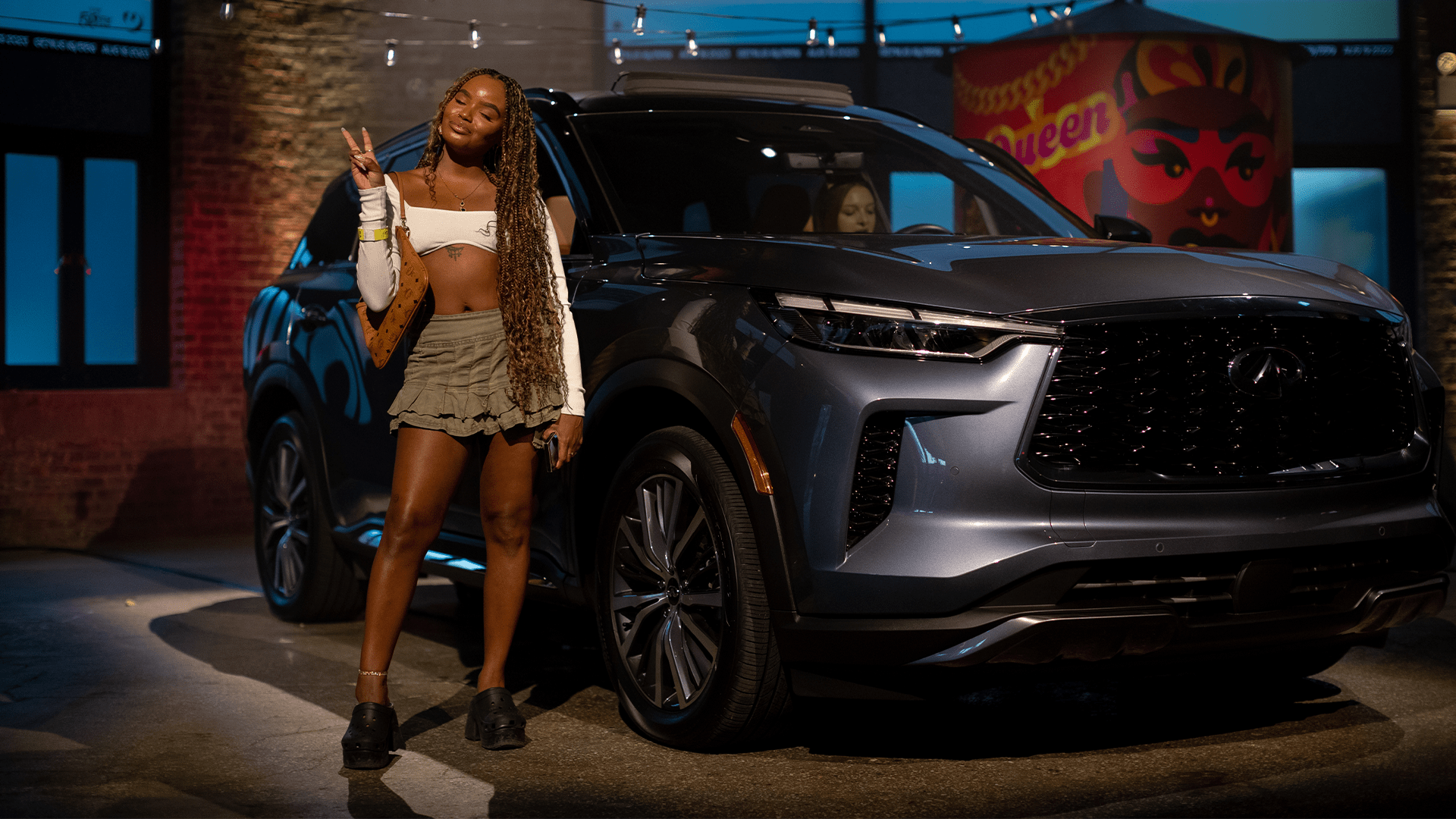
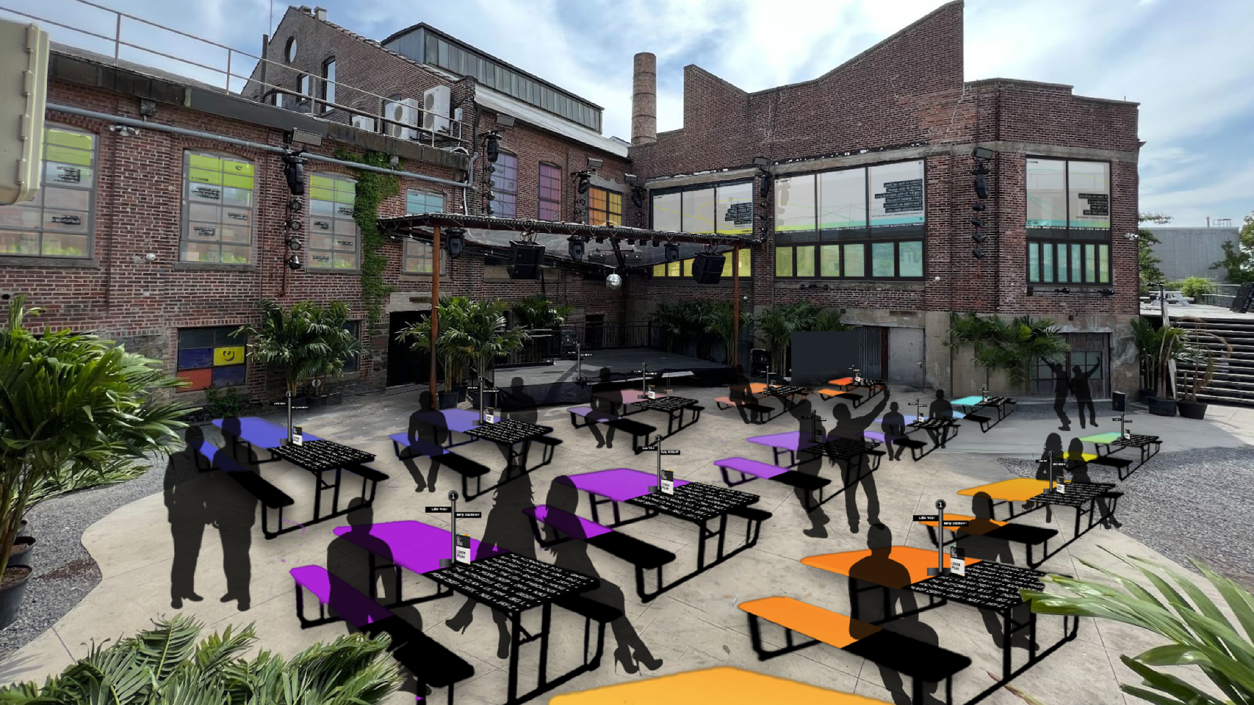
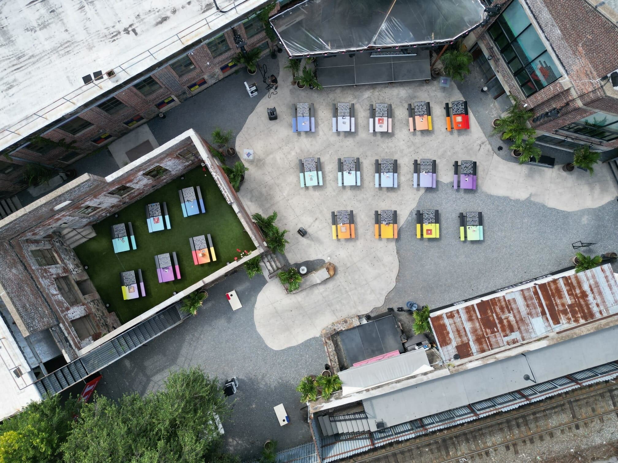
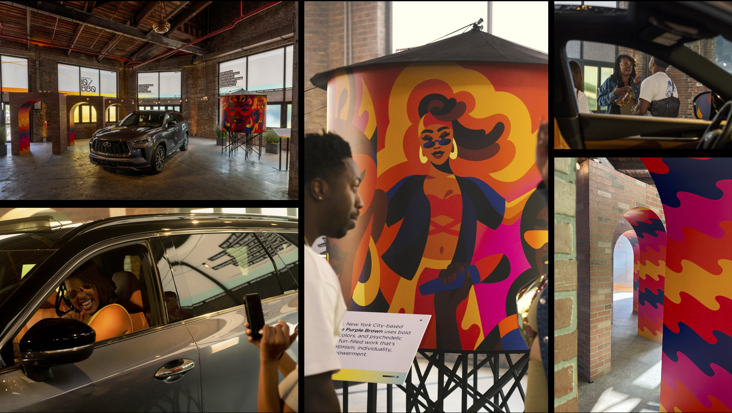
Immersive branding & stage design at The Knockdown Center in Brooklyn
A cohesive graphic system applied across:
500+ collateral assets, including signage, merch, and wayfinding
Large-scale environmental graphics that framed the performance stages and activations
Marketing & digital content amplifying the event’s identity online and IRL
Lead and managed a team of graphic, brand, and environmental designers ensuring seamless execution across all touchpoints
IMPACT
1.5K+ attendees across GA & VIP
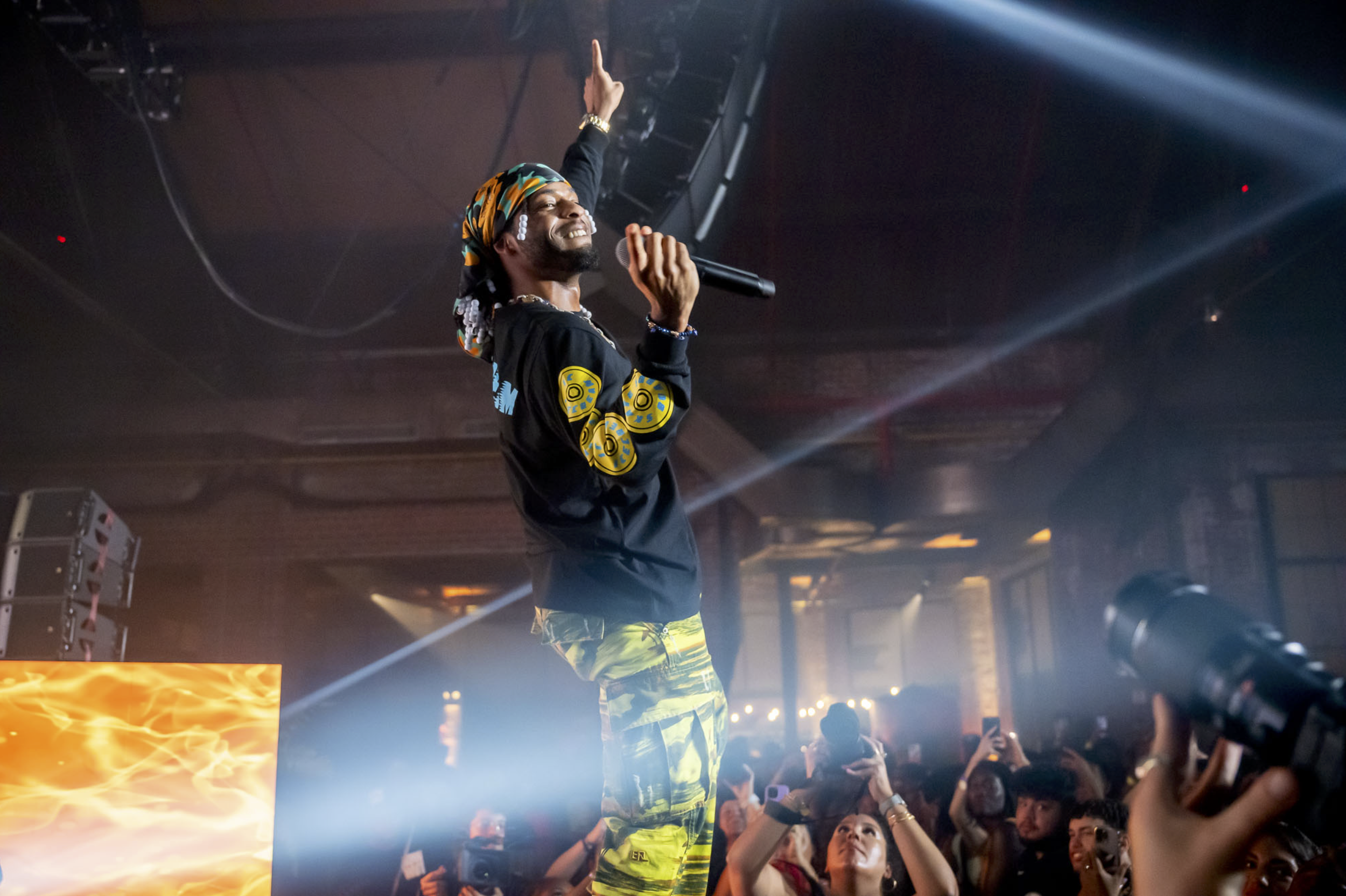
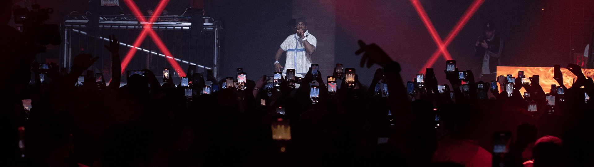
9 live performances, including the highly anticipated reunion of Clipse
Elevated Genius' brand presence, reinforcing its role at the intersection of music, culture, and storytelling
Enhanced fan experience, creating an immersive, visually cohesive event that honored hip-hop’s legacy
Theme & Positioning
THEME & POSITIONING
Celebrating the first
50 Years of Hip-Hop
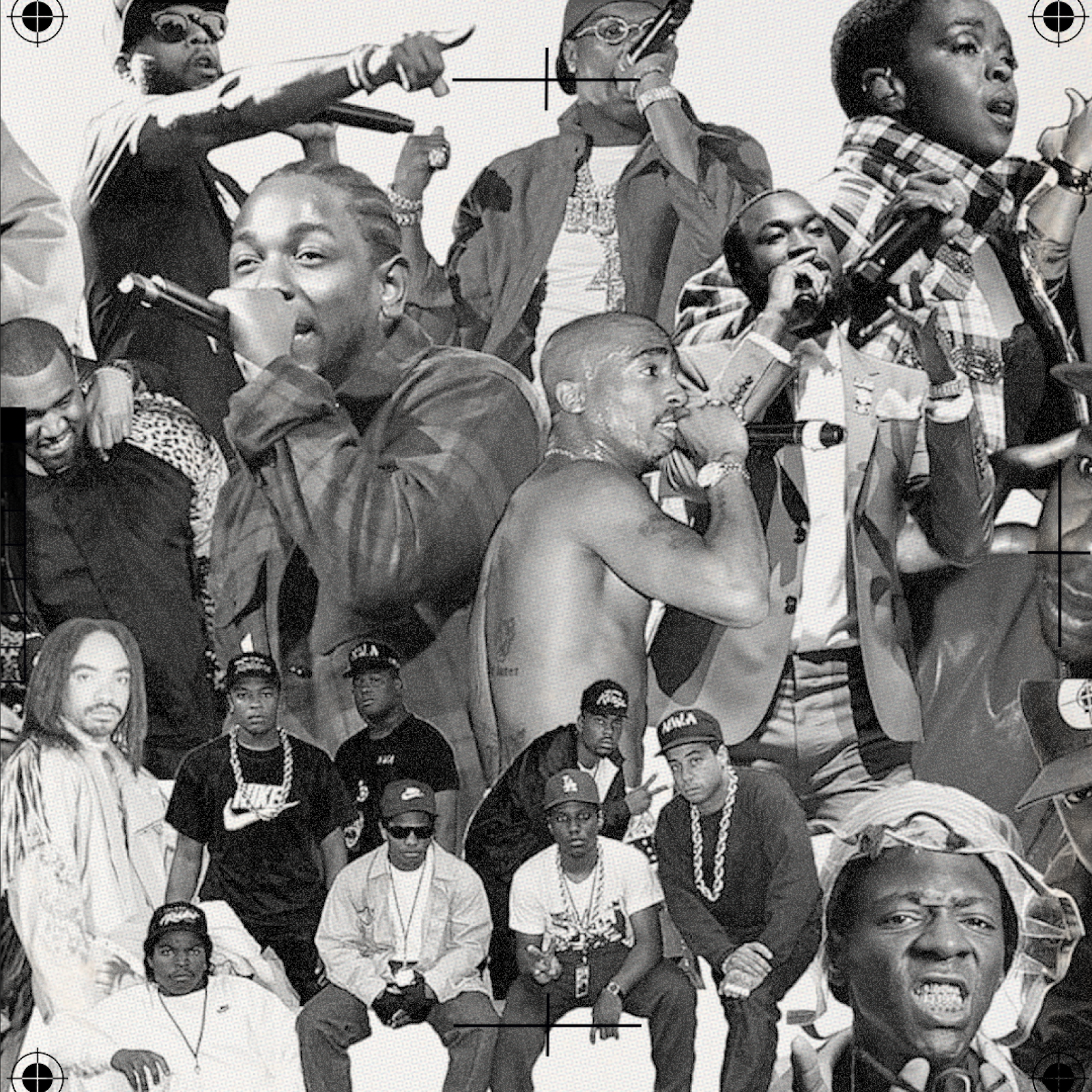
Genius’ celebration of hip-hop’s 50th anniversary was a year-long excursion illuminating the legendary lyrics, genre-defining beats, and insightful stories from the last five decades. Celebrating hip-hop is just another day at the office for Genius, but the 50 year milestone puts an even greater focus on our role in telling the deeper meaning behind hip-hop's most important moments.
Design System
DESIGN SYSTEM
Mood Board
& Inspiration
Hip-hop has always been a blend of technique and artistry. For The 50th design system, the interaction of precise and freeform elements bring this duality to life.
We found inspiration in hip-hop ephemera, rooting us in the exploration of knowledge around the genre's evolution and history. Subtle allusions to misprints and drafts show how even things that scale to the masses feel personal and tactile.
These small nods to found objects help bring out the grit from hip-hop’s foundations. A streamlined core palette with bold accents help us strike a tone of reverence. And personal, analog touches create a feeling of celebration.

DESIGN SYSTEM
Branding
Master Brand Identity
The Genius wordmark is to be used in all primary layouts and applications.
The Genius Icon “Sgnarly” is to be used in icons, products and applications with limited space or when there’s not urgent need to present the brand name in the form of wordmark.
The Sgnarly is conceived from the letter G of our logo rotated 90°. It is also a smiley face.
Using logo and wordmark together in the same layout should be avoided.
Primary Event Logotype
The 50th logo functions as the primary word mark to be used in all collateral.


DESIGN SYSTEM
Color Palette & Graphic Marks

DESIGN SYSTEM
Typography
Primary Typeface
Programme is the primary brand typeface for Genius. This is the default font typeface that should be used for most cases, including headlines, body copy, and lyrics. The family is available in three weights including italics.
Secondary Typeface
PPP Rader is our accent and headline typeface specifically for The 50th. It is used on the logo and should be used strategically as a complement to Programme.

DESIGN SYSTEM
Lyrics
Lyric treatment and formatting should be consistent across all 50th work.
Guidelines:
Use sentence case for the beginning of each lyrical bar - can start with lowercase if you need to break up a long line.
Start attributions with an en-dash, no space, comma after artist name, then song name in quotes
–Kendrick Lamar, “Rich Spirit”
For a lyric with multiple artists, use an ampersand
–Dreamville & EARTHGANG, “Everybody Ain’t Shit”
For a feature, start with the artist whose lyric is featured, comma, then list the main artist as a possessive.
–Big Freedia, Beyoncé’s “BREAK MY SOUL”

DESIGN SYSTEM
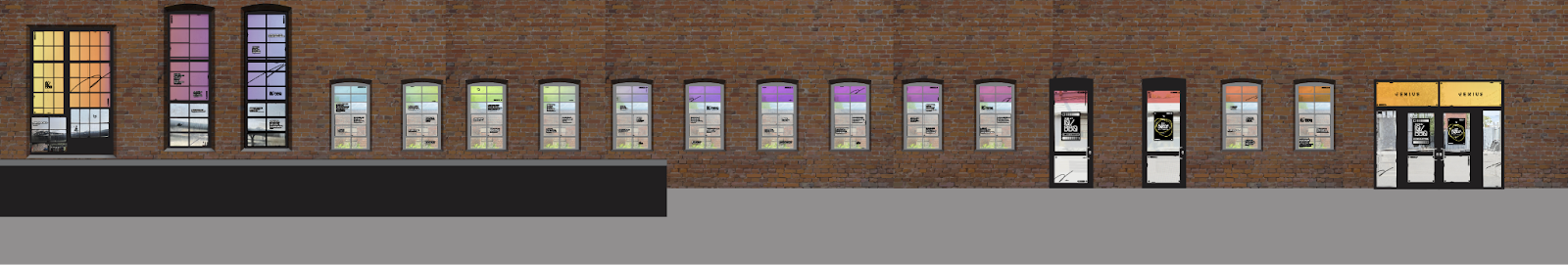
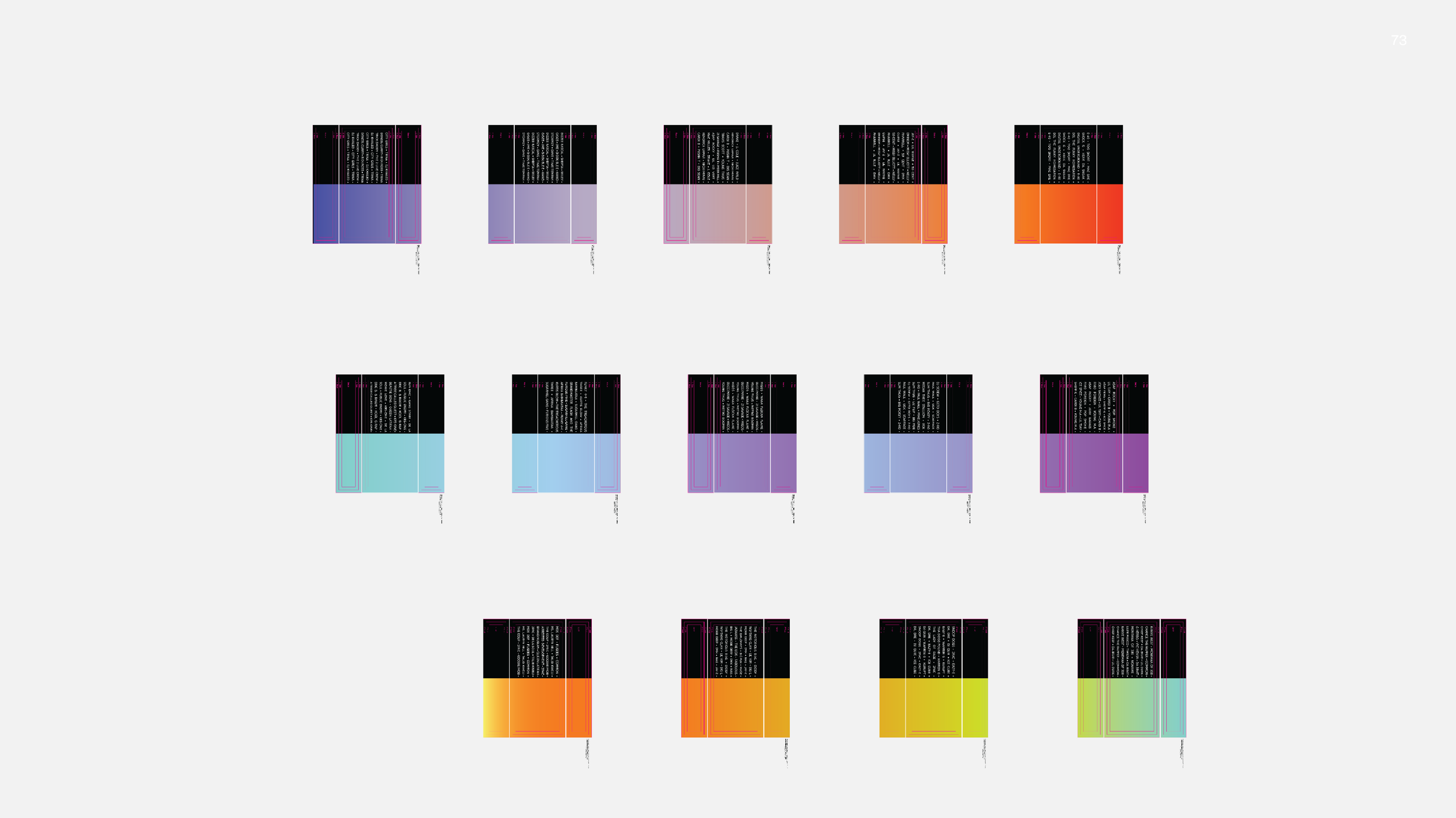
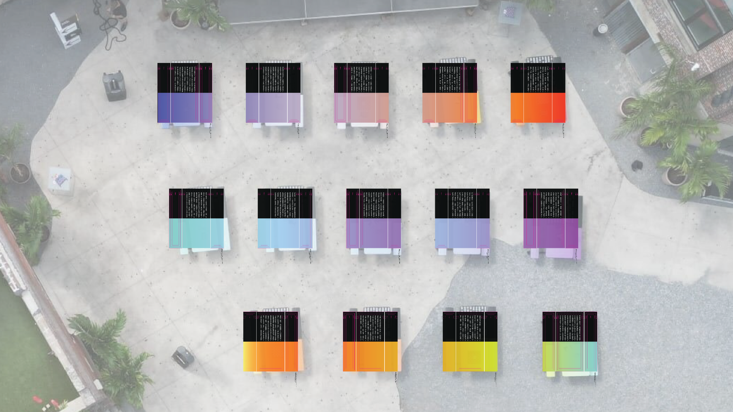
Collateral Overview

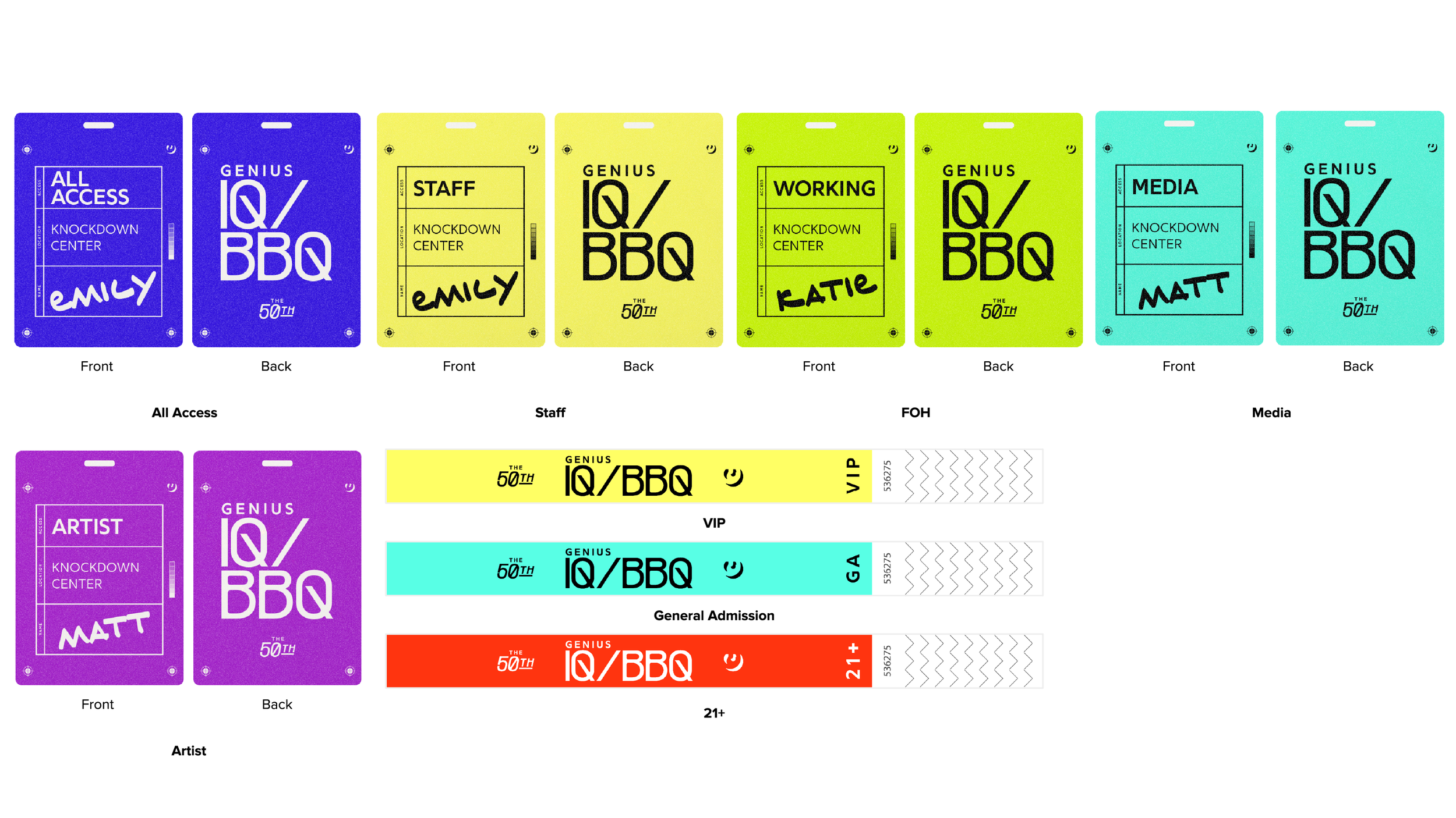
Lyric Takeover
LYRIC TAKEOVER
Executional Elements
-

Streamlined Palette
Grey and black are the grounding colors for the IQ/BBQ design system.
-
Archival Marks + Ephemera
Archival marks and vinyl slip form fields are used as inspiration for design accents. These elements combined with abstracted raster overlays and strategic cropping of elements elevate the graphic/atmospheric nature of the system.
-

Accent Colors
Accent colors from our secondary color palette work to intentionally complement our lyrics and photography. Color is used to both add pops of color and work as wayfinding for attendees.
-

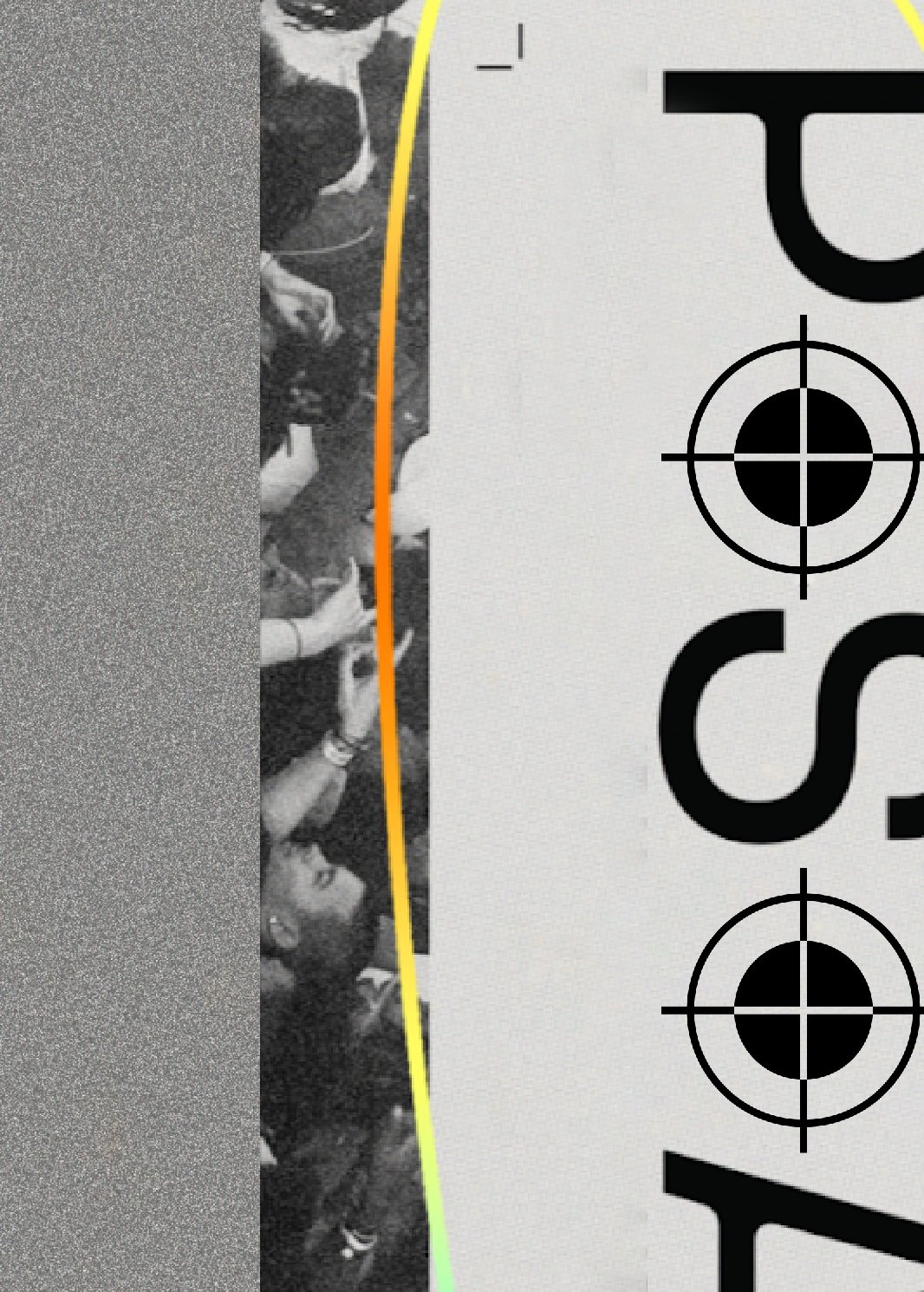
"Mis"registration Marks
Registration, crop, and mechanical marks are used to represent the “drafting” stage style. These elements are placed slightly off-centered to represent misregistration.
-

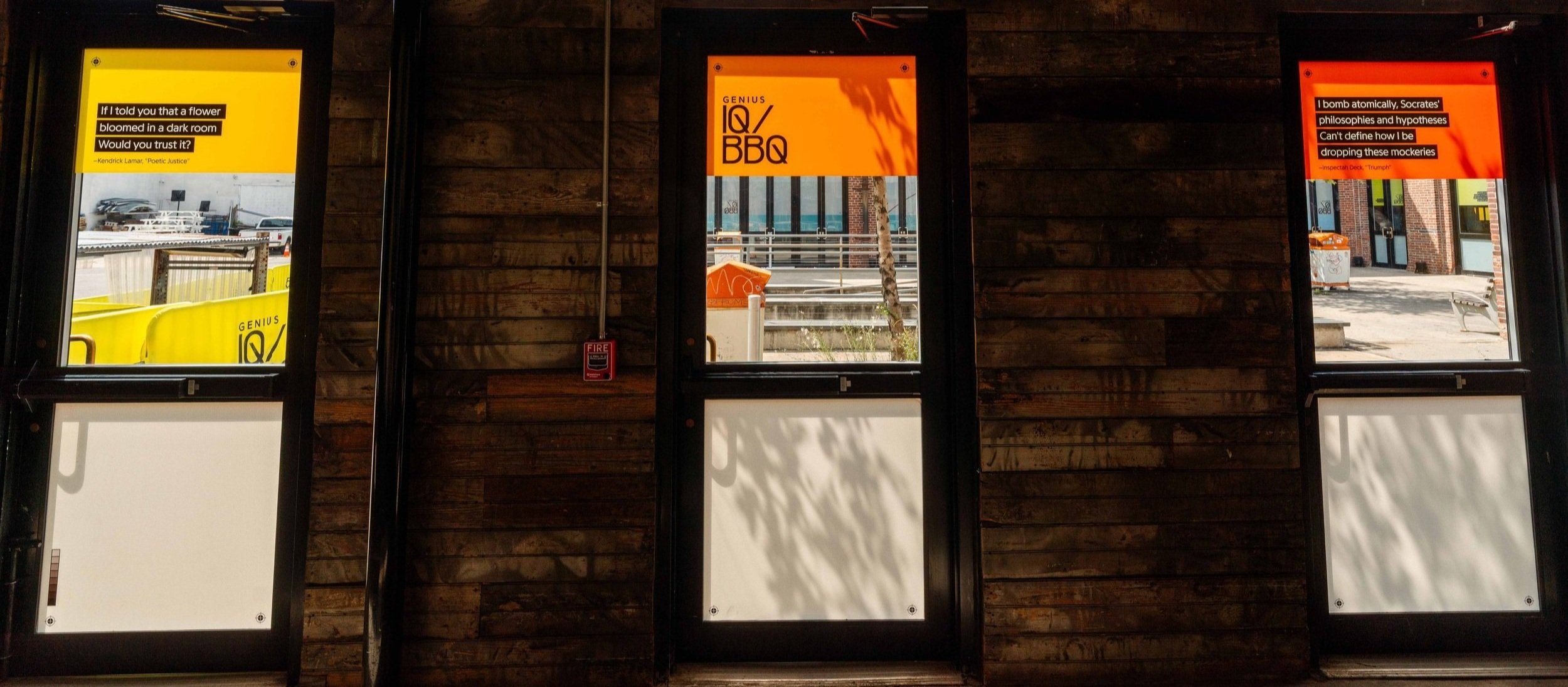
Lyrics & Ad-libs
Lyrics and ad-libs are cornerstones of the IQ/BBQ ethos and Genius’ core brand equity. They are woven throughout our print and environmental collateral to give guests the feeling that they’re encapsulated within the IQ/BBQ universe, both close-up and from far away.
-

Analog Marks
A nod to analog annotations and light imperfections adds secondary visual interest.
LYRIC TAKEOVER
Design Strategy
To help keep our design language consistent yet impactful, we recommend moving forward with two treatments to sizing of lyrics. The first, for larger, impactful, and eye-catching moments that will serve to set the tone as attendees explore the space. The second, for more intimate moments that will serve to blanket the venue and surround guests in lyrics.

LYRIC TAKEOVER
Graphic Placement Map
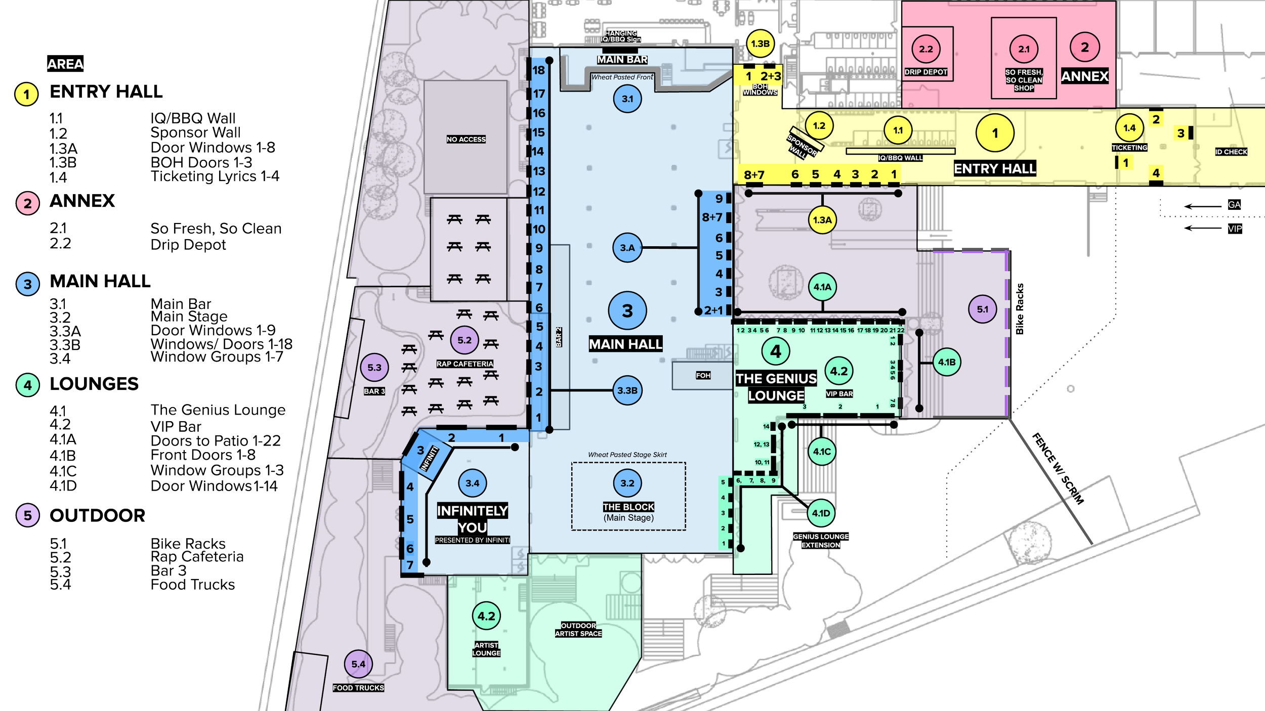
User Journey
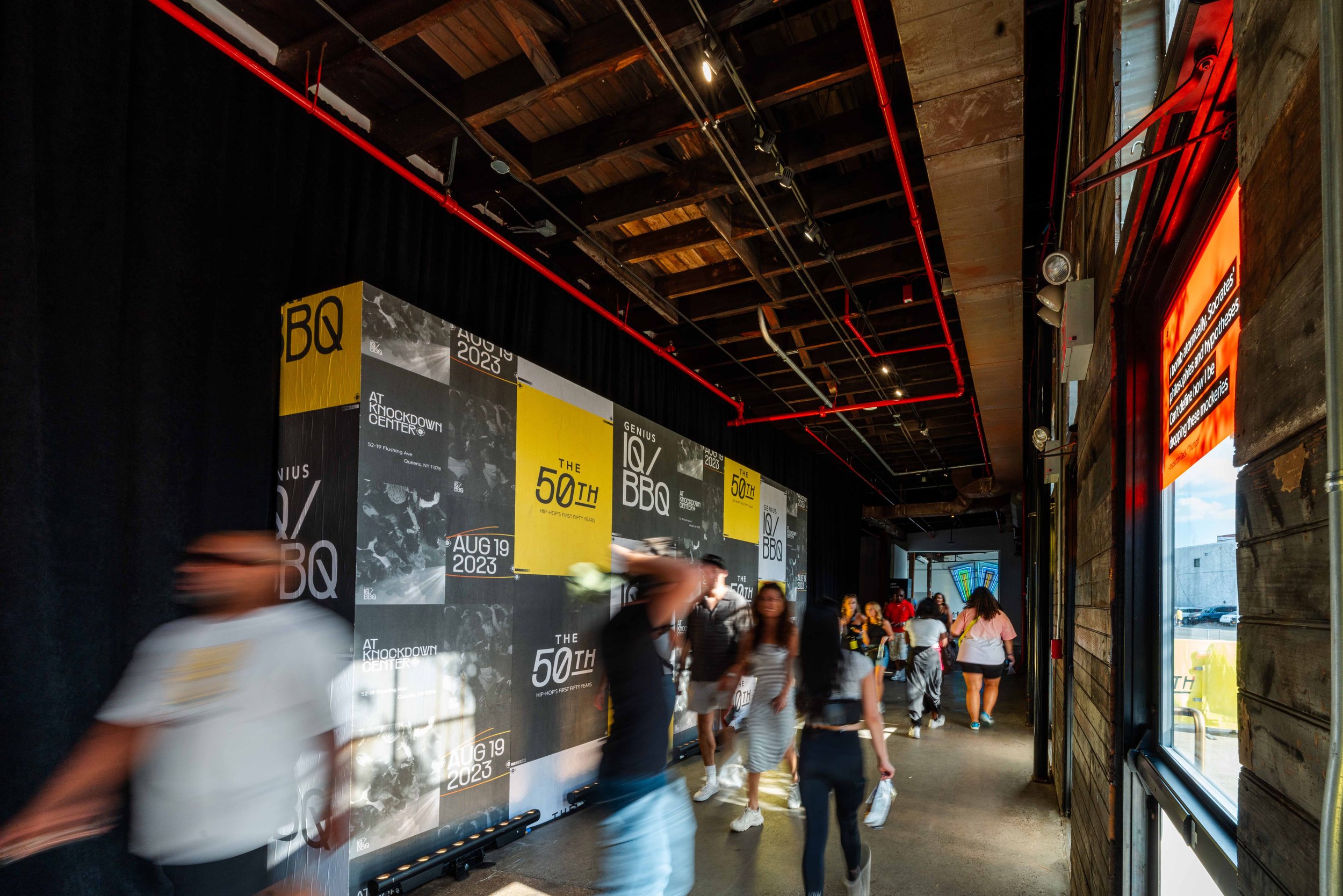
USER JOURNEY
Exterior


USER JOURNEY
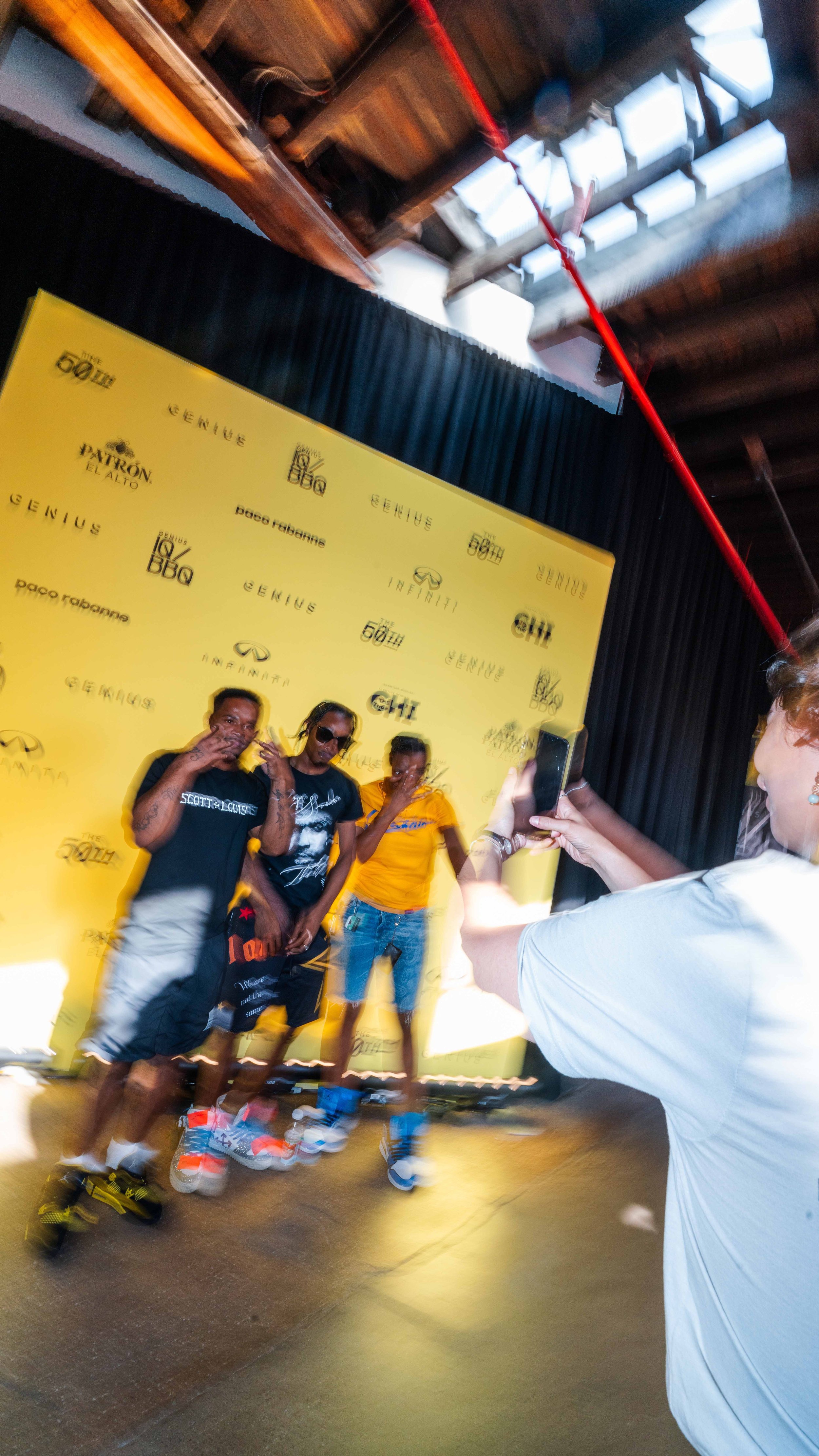
Verified Yellow Entry


USER JOURNEY
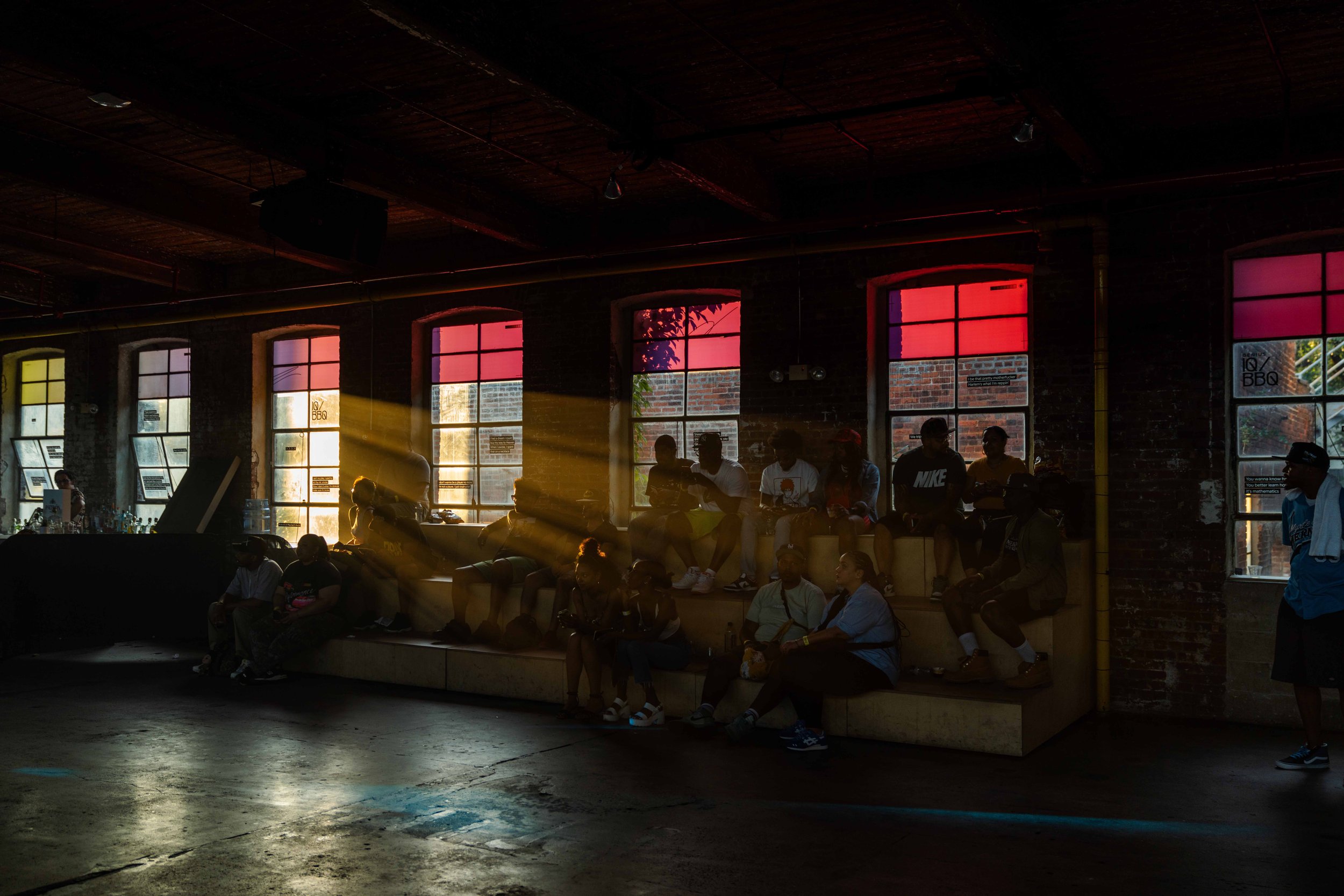
Main Bar

USER JOURNEY
Lyric Takeover


USER JOURNEY
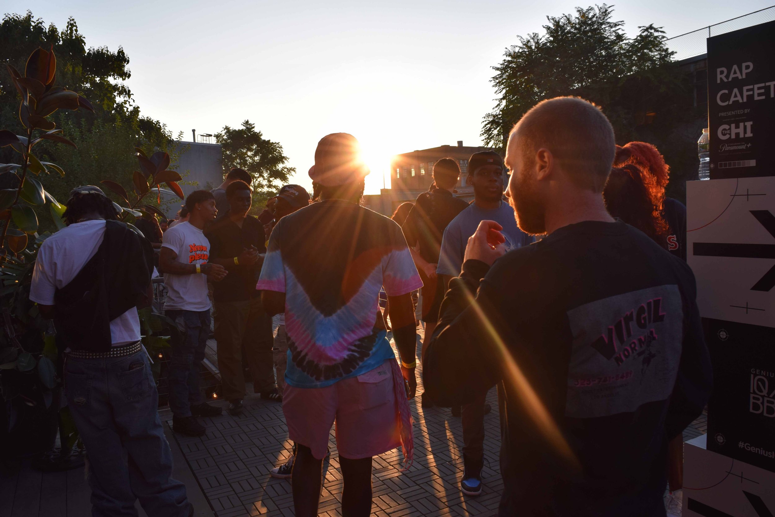
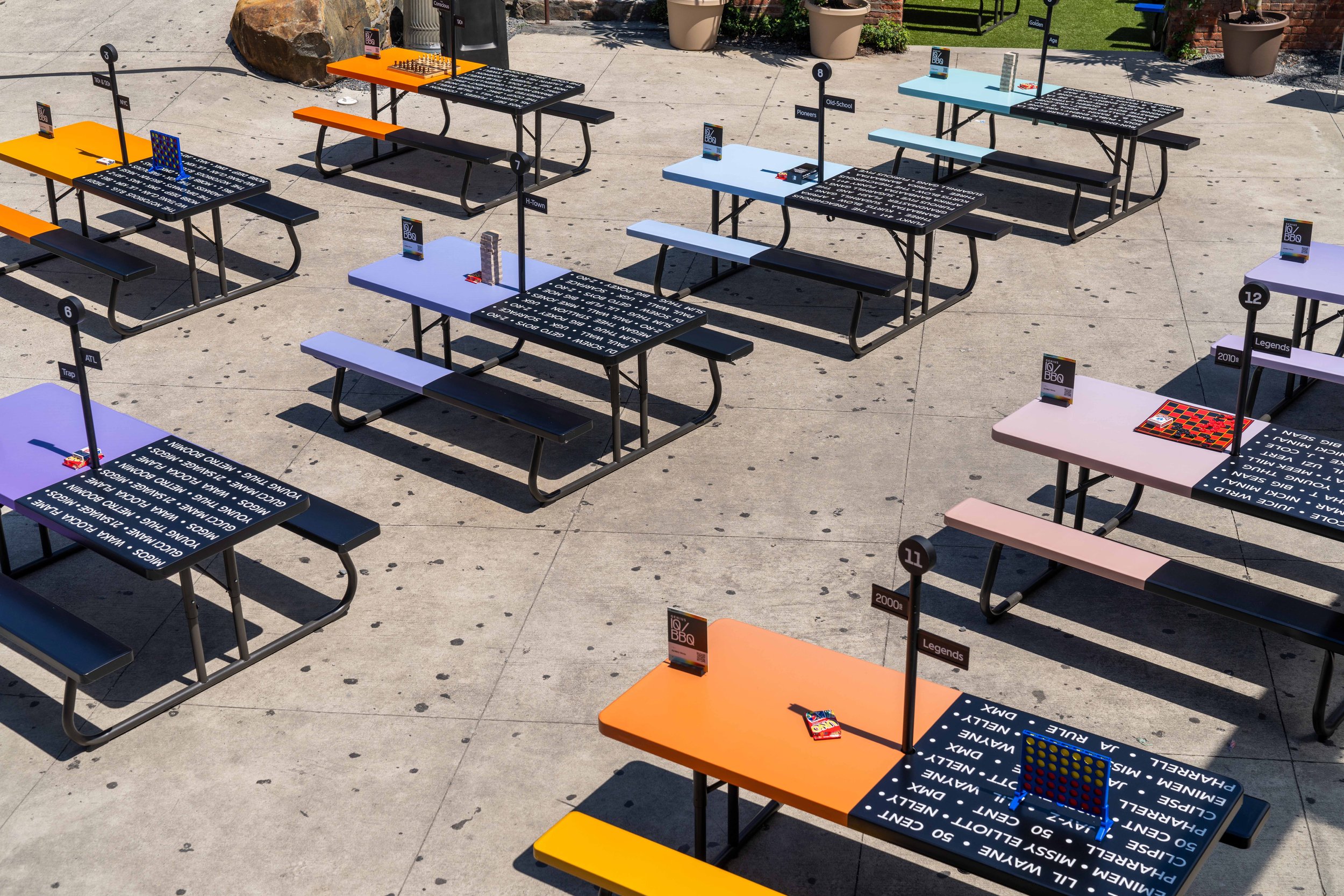
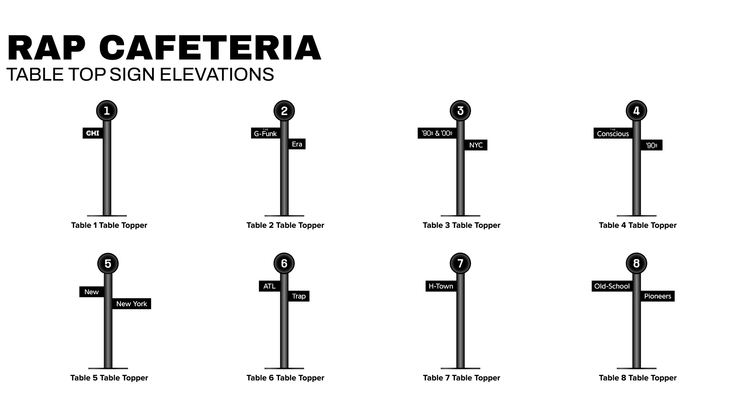
Rap Cafeteria


USER JOURNEY
The Genius Lounge


USER JOURNEY
Talent Lounge


USER JOURNEY
So Fresh, So Clean Shop


USER JOURNEY
Infinitely You


USER JOURNEY
Main Stage


How it went
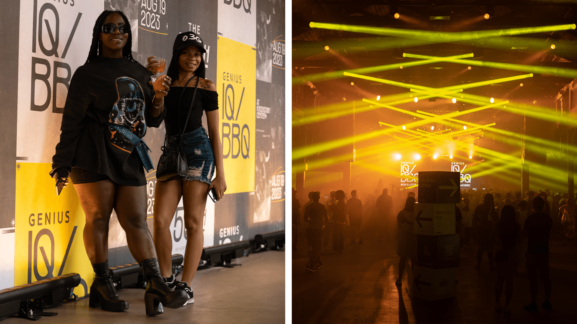
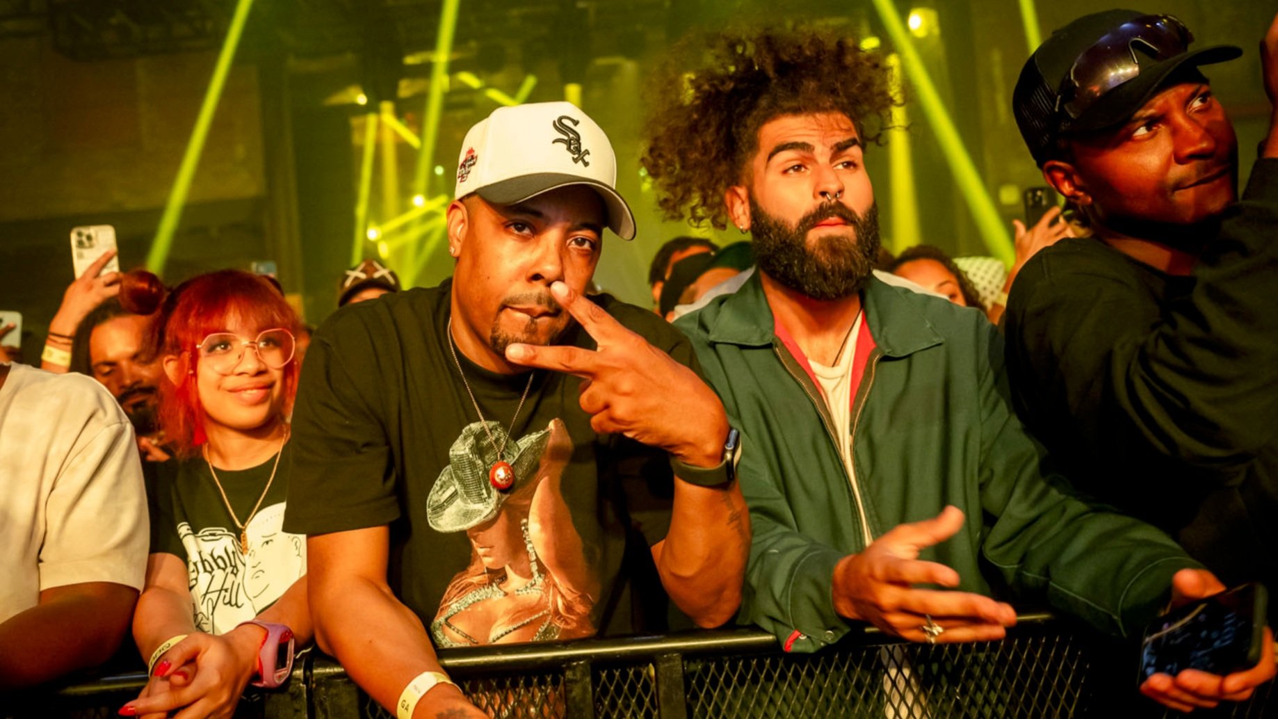
GENIUS IQ/BBQ
Press

GENIUS IQ/BBQ
The Vibes